Empower is a digital platform that helps companies prioritize employee health. The system helps companies facilitate data-driven wellness plans for a strong work-life balance and monitor collective team health.
Employee wellness and work-life balance go beyond pizza parties and company-sponsored happy hours.
Building a robust wellness app is no walk in the park – and we knew this going in. The process is chock-full of obstacles (foreseeable and unforeseeable).
Wellness is all about consistency. If the app we created was difficult to use, we knew employees would eventually stop using it – and their well-being would suffer. We quickly understood that we needed to create an experience that captivates, empowers, and encourages users to stay consistent with their wellness efforts.
This is the reality we were dealing with:
The users of this app have very limited time and attention. This made it crucial to avoid any extra bells and whistles to ensure the user journey is as streamlined and straightforward as possible.
This requires information to be presented in a clear and digestible manner – in turn minimizing cognitive load and guiding users through the app’s features.
How we leveled up employee wellness with a dose of convenience.
Our overarching strategy was to build an intuitive and engaging platform that would make it easy for users to take control of their health and wellness journey. Here’s how we did it:
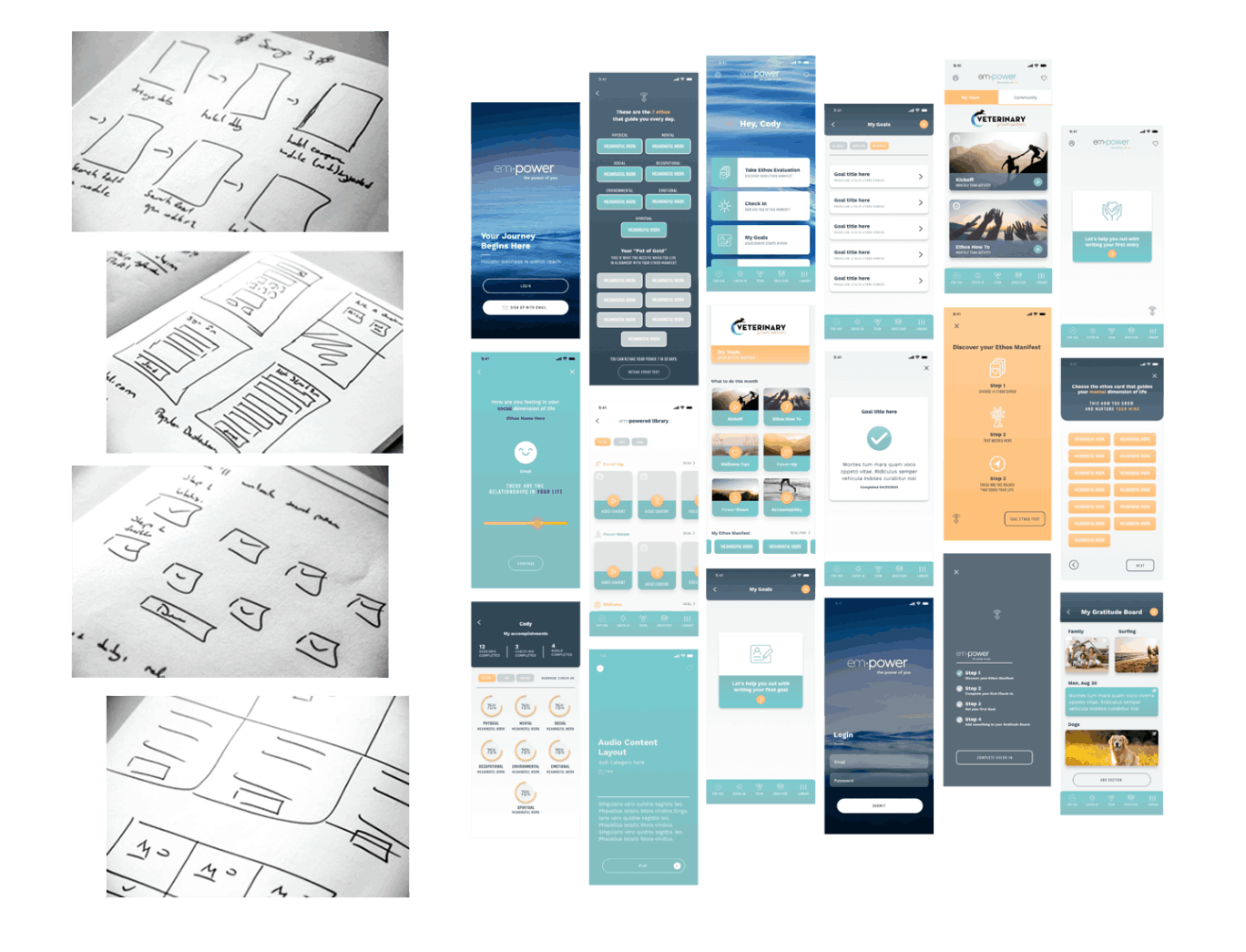
We started by creating interactive UI prototypes using an array of design tools and collaboration software.
The purpose of these prototypes was to help stakeholders and potential users experience the app’s initial functionality and provide feedback – which would serve as crucial insights as we developed the platform.
Our team updated the design based on this feedback to make sure the app met users’ expectations and aligned with the client’s vision.

To validate the effectiveness of the design, we conducted testing sessions with a group of target users.
This provided extremely valuable insights into how users interacted with the app. More importantly, it identified any pain points, kinks, or usability issues. The feedback received was our compass in how we refined the design further.
Cross-platform compatibility is a hurdle all developers face – and we needed to make sure the app worked seamlessly, regardless of the user’s device. This meant perfect transitions between smartphones, tablets, and web browsers.

Once the design was refined and approved, we collaborated closely with the development team to make sure the implementation of the UX/UI design went off without a hitch.
This involved providing detailed design specifications, style guides, and other client assets to facilitate the development process. We also conducted regular quality assurance checks to maintain design integrity during implementation.
We finally launched the platform onto the Apple App Store and Android’s Google Play – after having developed it from scratch through a lot of blood, sweat, and tears.
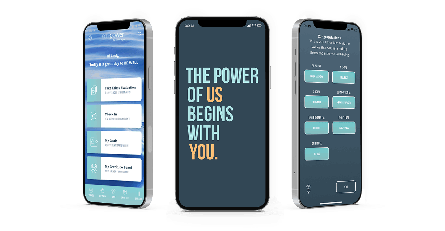
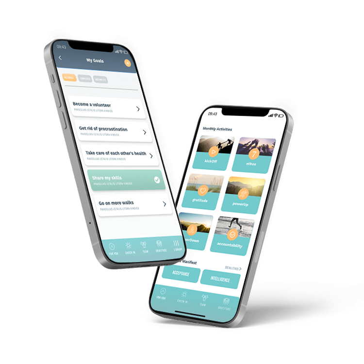
Intuitiveness was the guiding star of our design.
Users need simplicity, especially when it comes to managing their health. We needed to almost over-compensate the user-friendliness of the app to guide users toward their goals.
To do this, our solution involved reducing cognitive load, presenting information in a digestible manner, and navigating users through the app’s features with the utmost clarity.
Simplicity, my friends, is the ultimate sophistication.

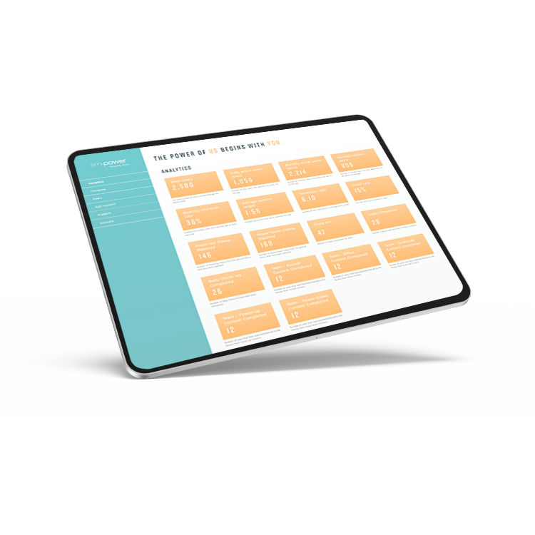
The proprietary engagement platform we built provided smart employee wellness analytics to help guide the app experience.
By monitoring collective team health, companies can conveniently offer employee benefits that truly matter and make a real difference.
The empower platform provides analytics on the daily overall pulses of employees’ well-being. This helps to appropriately direct funds and energy to meet your team’s needs. By tailoring the platform to restore employee health, your business can invest wisely and create a healthier employee experience.
